Google Messages and Contacts: The New Gradient Icons Are Finally Here
—
# Google Modernizes Its Visual Identity: Monochrome is Out for Messages and Contacts
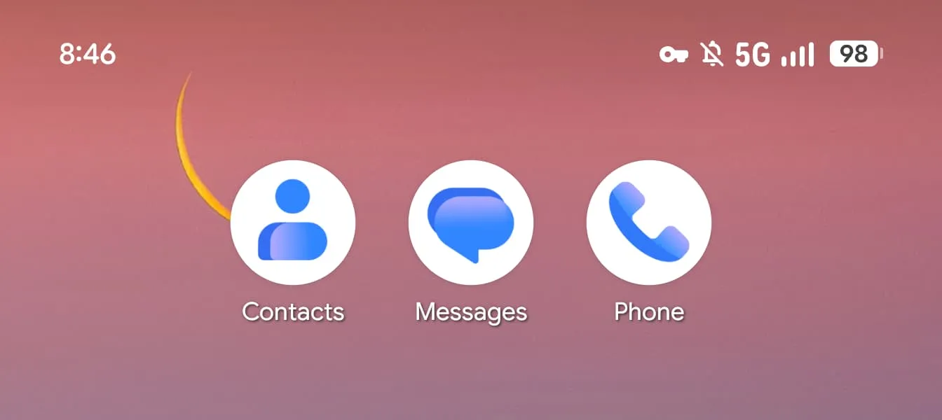
An Aesthetic Update Without Functional Disruption
The Android ecosystem has just welcomed a new wave of major visual updates. This week, the Mountain View giant officially rolled out its new gradient-colored icons on two flagship apps: Google Messages and Google Contacts. After weeks of testing in beta versions, these graphical changes are now available to users on stable channels.
Unlike certain software overhauls that disrupt the user interface, this operation remains reassuringly subtle. The geometric shape of the icons remains unchanged: you still find the human silhouette for the address book and overlapping speech bubbles for instant messaging. However, the size has increased slightly to occupy the circular background space with more grace and precision.
The Aesthetic: Lightness and Modernity
The most notable change lies in the color palette. Google has abandoned solid tones in favor of subtle but impactful gradient effects. A lighter shade of blue serves as a base, upon which flowing nuances impart a sense of fluidity to the visual identity.
According to product leadership, this evolution allows the logos to appear “sharper, more precise, and never clearer.” The goal was clear: lighten the visual weight of the apps to give them a more contemporary look, thus aligning with current UI design trends that prioritize depth and texture.
Deployment Schedule and Current Status
The transition to this new visual identity was not simultaneous for all applications. Here is the breakdown of the rollout:
- **Google Contacts**: This was the last link to be refreshed in the Android ecosystem. Version 4.92.26.x was distributed to users on Wednesday evening, marking the end of the update cycle for this app.
- **Google Phone**: This app received its overhaul two weeks ago, on Monday, and is already fully available to all stable users.
It is important to note that this week does not mark the beginning of a global overhaul of the SMS/RCS client. No other functional changes accompany this graphical update. The major overhaul of the main home page remains in beta for voluntary users.
Towards a Unified Visual Identity?
With full deployment on these three communication apps (Messages, Contacts, and Phone), Google is solidifying its design system approach. The systematic use of gradients is no longer limited to web services like Gmail or YouTube but now extends to the very heart of the native mobile experience.
This evolution signals that native app developers must soon integrate these graphic standards to remain competitive. For the average user, it is an aesthetic improvement requiring no adaptation, making the interface more pleasant to look at without sacrificing ease of use.
—